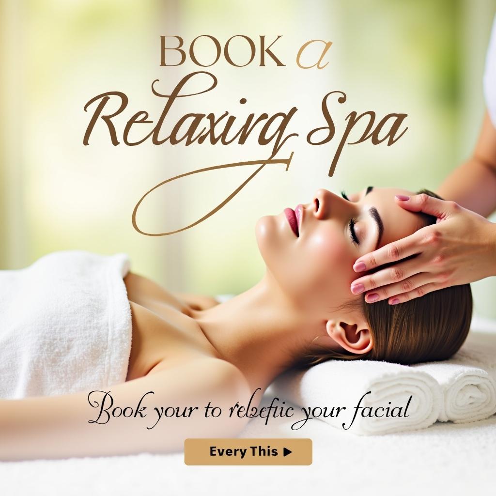
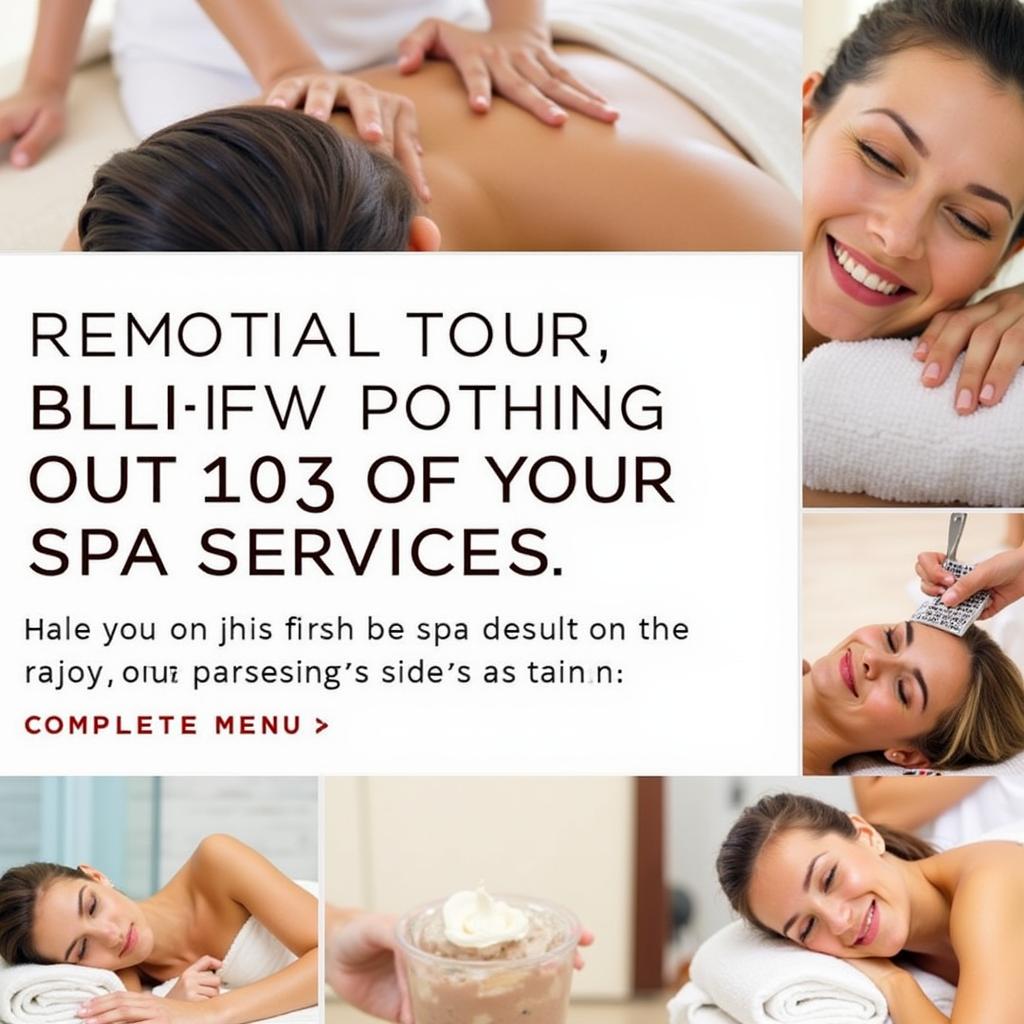
Creating an eye-catching and effective Spa Banner Design is crucial for attracting new clients and promoting your business. Whether you’re a seasoned spa owner or just starting out, a well-designed banner can make all the difference in conveying your brand’s message and captivating potential customers.
This guide will provide a comprehensive overview of spa banner design, covering essential elements, design tips, and inspiration to help you create a banner that truly shines.
What Makes a Good Spa Banner Design?
A good spa banner design is more than just a pretty picture. It should effectively communicate your brand’s essence and entice potential clients to learn more about your services. Here are key elements to consider:
1. Eye-Catching Visuals:
- High-quality images: Use professional photographs or illustrations that evoke a sense of tranquility, relaxation, and luxury.
- Color palette: Choose a color scheme that aligns with your brand and creates a soothing and inviting atmosphere. Pastel shades, natural tones, and calming hues are popular choices for spa banners.
- Visual hierarchy: Use size, contrast, and placement to guide the viewer’s eye to the most important elements of your design.
2. Compelling Copy:
- Clear and concise: Keep your text brief and easy to read. Focus on the key benefits of your spa services and what makes your business unique.
- Appealing language: Use descriptive words that evoke emotion and create a sense of desire, such as “refresh,” “rejuvenate,” “indulge,” and “escape.”
- Strong call to action: Clearly tell your audience what you want them to do, whether it’s visiting your website, booking an appointment, or learning more about your spa.
Design Tips for Spa Banners
Here are some practical tips to guide your spa banner design process:
1. Define Your Target Audience:
Understanding your ideal customer is crucial for creating a banner that resonates with them. Consider their age, demographics, lifestyle, and interests to tailor your design accordingly.
2. Focus on Your Brand Identity:
Your spa banner should reflect your brand’s unique personality and values. If your brand is known for its luxurious and holistic approach, your banner should reflect this.
3. Choose the Right Format and Dimensions:
Different platforms have specific banner size requirements. Ensure your banner adheres to the recommended dimensions to avoid cropping or distortion.
4. Use Fonts Wisely:
Choose readable and aesthetically pleasing fonts that complement your overall design. Sans-serif fonts are generally preferred for their clean and modern look, while serif fonts can add a touch of elegance.
5. Incorporate White Space:
Allowing for breathing room in your banner design helps to prevent it from feeling cluttered and overwhelming.
6. Add a Touch of Personalization:
Consider incorporating unique elements that distinguish your spa, such as a signature treatment, a tagline, or a logo that reflects your brand’s identity.
Spa Banner Design Inspiration
For inspiration, let’s explore some examples of captivating spa banner designs:
-
Example 1:
 -
Example 2:
 -
Example 3:

What Does a Spa Expert Say?
“Creating a successful spa banner goes beyond aesthetics. It’s about capturing the essence of your brand and connecting with your target audience on an emotional level,” says [Name of fictional spa expert, e.g., Dr. Annabelle Reed, renowned spa therapist]. “The right combination of imagery, copy, and design elements can truly transform your spa into a welcoming and inviting oasis.”
Conclusion
Designing a spa banner that effectively captures your brand’s identity and attracts new clients requires careful consideration of key elements and design principles. By incorporating the tips and inspiration provided in this guide, you can create a banner that not only showcases your spa’s unique offerings but also invites potential clients to embark on a journey of relaxation and rejuvenation.
Remember, a well-designed spa banner is an essential marketing tool that can help you reach new heights of success in the competitive world of wellness and beauty.
FAQ:
Q: What are some of the most common mistakes people make when designing spa banners?
A: Overcrowding the design with too much text, using low-quality images, and neglecting the importance of a clear call to action are common pitfalls.
Q: How can I create a spa banner that stands out from the competition?
A: Consider incorporating unique elements, such as your spa’s signature treatment or a tagline that reflects your brand’s unique personality.
Q: What is the best way to get feedback on my spa banner design?
A: Share your designs with colleagues, friends, and family for their honest opinions. You can also seek feedback from spa marketing experts.
Q: What are some affordable ways to design a professional-looking spa banner?
A: You can utilize online design tools, templates, or hire a freelance graphic designer.
Q: How often should I update my spa banner design?
A: It’s recommended to refresh your banner designs every 3-6 months to keep them fresh and relevant.
When you need assistance or have any questions, please don’t hesitate to reach out to us at [Phone number] or [Email address]**. We have a dedicated team of customer care experts ready to assist you 24/7.